")
*筆者: (近期看到的飯店月餅Logo又再提醒筆者該把草稿完成~~@@)
洲際酒店集團從2018年收購麗晶集團51%股份後,就持續不斷地進行品牌重生的改造計劃,去年是品牌定位(文章01 / 文章02 ),今年近期則是品牌標誌的更新,在在顯示洲際集團經營其奢華品牌區塊的專心致志。
無獨有偶,擁有29個酒店品牌的萬豪酒店集團在併購案後也針對喜來登品牌進行改造計畫,或者對於品牌定位或意象進行調整與強化(如艾美酒店等「特色品牌」);而雅高酒店集團在近年大量與多元併購後也即將在今年推出新的、全生活方位的會員制(→當然,確立集團事業版圖後的整頓應該會是未來的重點工作,因為已有會員反映旗下酒店據點的品質穩定度與一致性的根本問題。→擴張太快了…親愛的 @@ )
至於台灣,許多獨立自營與集團式的業者近年來紛紛「加開外掛」,建立起新的、有現代設計感的、迎合年輕世代的旅館品牌,這種「有意識到潮流趨勢之策略」雖然值得嘉許,但可惜的是,既有、相對的「資深」品牌就呈現一種「放牛吃草」、「倚老賣老」的疲態,這也是先前的文章字句中偶爾會有「賣老臉」一詞出現的原因(→猶如臉書使用者的老化或熟齡化現象,年輕世代見勢頭不對,早已紛紛轉往IG或其他社群媒體→塊逃啊啊啊…)。這種現象也恰好反映了人類家族世代間的現象與問題,無怪乎,人類創造了品牌,同時也反映了自己的生命百態(人類所發展出的城市也是同理可證)。對於台灣本土旅館飯店品牌的觀察與看法,未來應該有機會再度「跨界」,以專文的方式「就事論事」地分享(→第一次跨界是在「W 兩個世界」的系列專文。文章01 / 文章02 / 文章03 )。
品牌仍具有號召力並未死去(→反對的人,應該先把手中的iPhone或三星手機給扔掉 XD ),口碑分享與社群評論只是推波助濫的工具。當外在世界的人們紛紛檢視自家的品牌是否有調整、提昇甚至再造的可能性,是否要調整集團的發展經營策略,而有絶佳範例呈現之際,是時候也該想想自己手中的牌或籌碼,能否還玩得起這市場賽局。一起來看看洲際集團所做的努力與進行中的個案範例。
Regent Hotels & Resorts reveals new logo
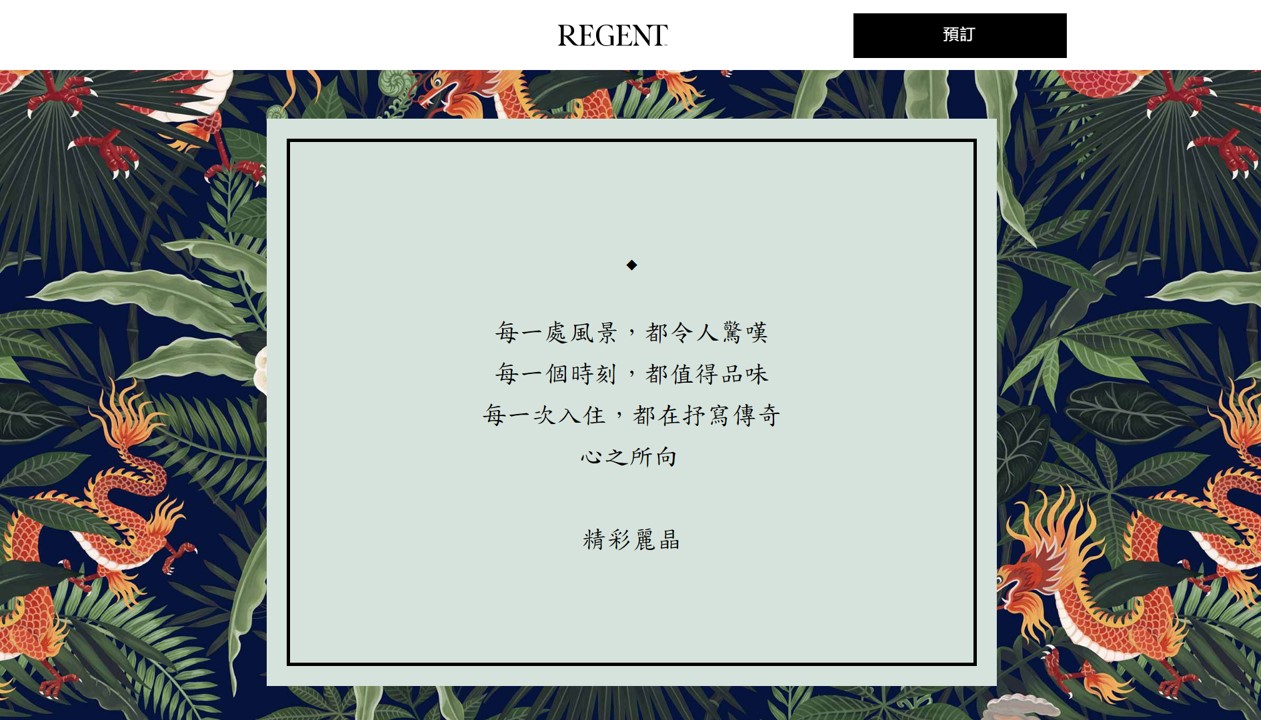
麗晶酒店公佈全新品牌標誌
2019/05/27 洲際集團官方新聞稿
IHG® (InterContinental Hotels Group), one of the world’s leading global hotel companies, unveils Regent Hotels & Resorts’ new logo and monogram. The logo is designed to epitomize modern luxury with a nod to traditional cues respecting the brand’s heritage and identity. It is bold, confident and sophisticated balanced with a warm elegance that is in line with a modern hospitality brand.
全球領先的國際連鎖酒店集團之一的洲際酒店集團揭曉麗晶酒店暨渡假酒店的新標誌和字母設計。 該標誌旨在體現現代奢華,並對麗晶品牌的經典地位之傳承脈絡致敬。 它大膽、自信和精緻兼具和煦的優雅,符合現代的酒店品牌應有的特色。
The logo creation is an extension of the Regent rebranding journey which started last year. To deliver a deeply curated luxury brand at pace, IHG gathered learnings from outside of hospitality, engaging luxury tastemakers and experts from diverse fields to take the brand into the future of luxury. In the same vein, IHG engaged a panel of leading creatives and experts from fashion and luxury such as celebrated fashion designer, Tanya Golesic, President Jimmy Choo, America’s, Designer Bibhu Mohapatra and Designer Simon Spurr to provide feedback on the logo design. Their insights helped shape the design directions that resonate most with our guests and best reflect the characteristics of Regent.
創造標識的部份是去年麗晶品牌再造進程的延伸。 為了能依規劃的步調來傳達精心打造的奢華品牌,洲際酒店集團向業外汲取設計心法,邀集了不同領域的奢侈品業界人士與專家,希望麗晶品牌能往奢華的未來趨勢邁進。洲際酒店集團所邀集的專案小組成員皆為引領時尚和奢侈品領域的創意人士和專家,比方像是著名Jimmy Choo(周仰傑)時裝設計公司的美國暨加拿大總裁 Tanya Golesic,美國時裝設計師 Bibhu Mohapatra和英國時裝設計師 Simon Spurr,得以提供關於麗晶標誌設計的反饋。 他們的見解洞察幫助洲際集團形塑出最能與我們的客人產生共鳴的設計方向,並且能最完整反映出麗晶酒店的特點。
 |
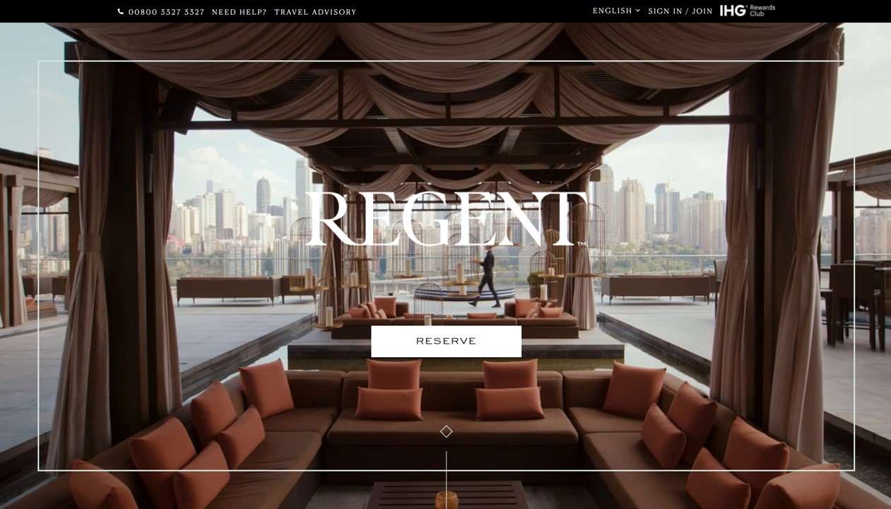
| 新麗晶品牌標誌在官方網站上的呈現01 (截圖來源:集團官網 ) |
Designed by renowned creative director and typographer, Andreas Neophytou, who has done work for the world’s leading luxury brands, the new logo is defined by an elegant simplicity. Built on the legacy of the original logo, the leg of the R is extended in a lateral curve from the stem downwards to the baseline, eventually joining it to the “e” resulting in a referential brush-like character the subtly alludes to the primary one.
麗晶品牌標誌由知名的英國廣告行銷公司Spring Studio 創意總監暨文字設計師 Andreas Neophytou所設計發想,他曾設計過許多世界頂級奢侈品牌,而麗晶的新標識以優雅簡約為定調。 (以上方圖片來看)麗晶品牌標誌以原始標誌的傳承為基礎,字母R的最後一筆是從左方的一豎由下往標誌基線延伸的橫向曲線,最後連接到字母E,從而產生類似指向式的刷狀特徵。此特徵也巧妙地暗示了首個字母。
When the Regent brand was founded over 40 years ago, it changed the face of modern luxury. It was a pioneer in hotel design with bold firsts that captured imaginations and set new standards in luxury and will continue the legacy of ultimate luxury hospitality.
當麗晶品牌在40多年前成立時,它改變了現代奢華的風貌。 麗晶酒店憑藉著數個大膽且富有想像力的「首發、第一」之舉成為酒店設計領域的先行者,它樹立了奢華的新標準,並將繼續傳承極致奢華的待客之道。
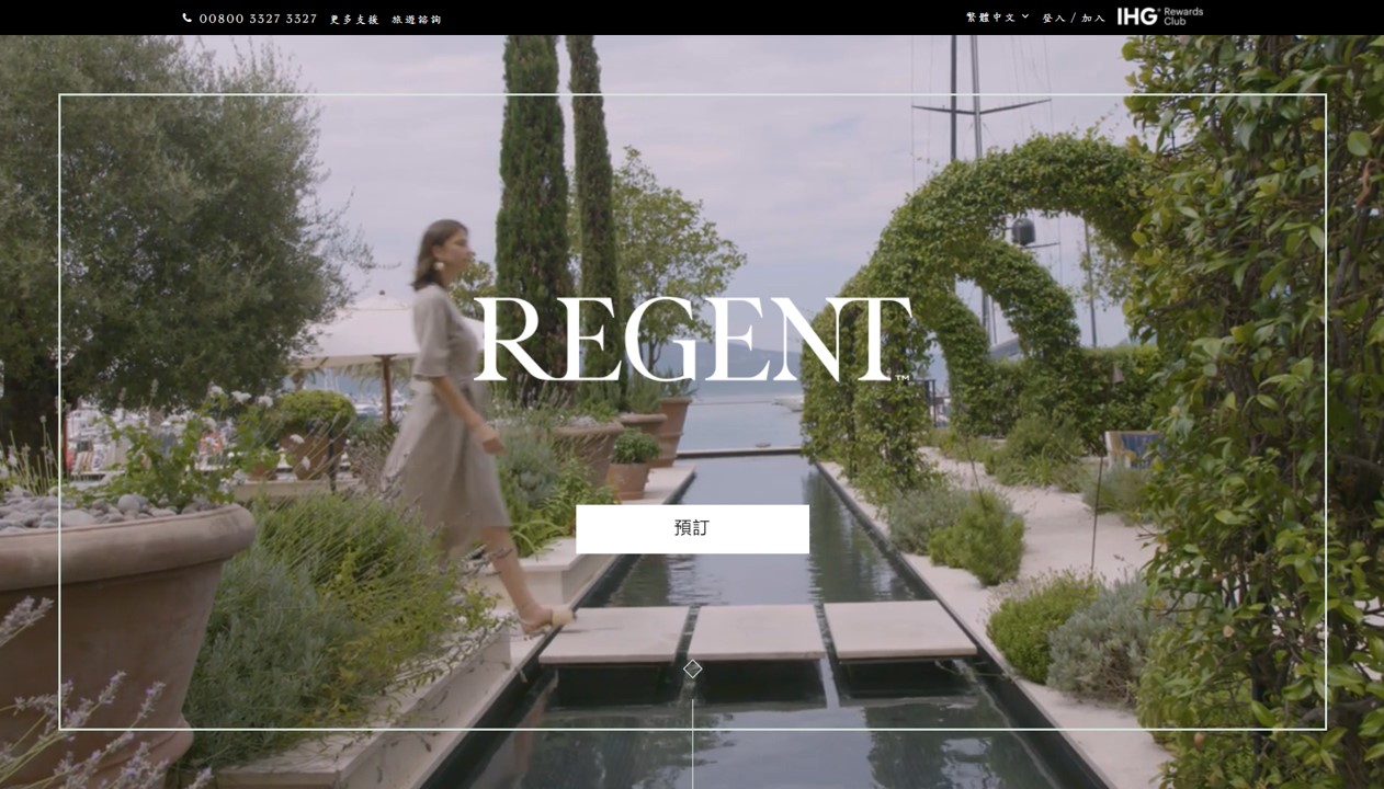
 |
| 麗晶品牌定位在官方網站上的呈現風格 (截圖來源:集團官網 ) |
Regent Hotels & Resorts is present in five countries with six open hotels including the award winning Regent Beijing, Regent Berlin and Regent Porto Montenegro and four properties due to open in the next three to five years in Hong Kong, Jakarta, Kuala Lumpur and Phu Quoc.
麗晶酒店暨渡假酒店目前在五個國家地區有六家營運中的酒店據點,包括獲獎的北京麗晶酒店,柏林麗晶酒店和黑山港麗晶酒店,而未來三到五年內將有四個據點在香港,印尼雅加達,馬來西亞吉隆坡和越南富國島開設。
For further information please contact:
詳情請洽:
Anne-Lise Berthon
annelise.berthon@ihg.com
+65 6395 6147
 |
|
|
Regent Hotels Reveals New Logo and Monogram
2019/06/03 logo-designer.co
| 麗晶酒店的新品牌標誌 |
Regent Hotels & Resorts has unveiled a new logo and monogram as part of a major brand refresh.
麗晶酒店暨渡假酒店推出了新品牌標識和字母設計以作為主要品牌再造的一部分。
Designed by typographer Andreas Neophytou, the new logo is described as having “elegant simplicity”, and is further claimed to have been built on the legacy of the brand’s original, copperplate-esque wordmark.
麗晶酒店的品牌標誌由文字設計師Andreas Neophytou所設計,該標識被描述為具有「優雅的簡約」,並表示品牌標誌是依其品牌原創、銅板式文字商標的歷史傳承所建立。
“The logo is designed to epitomise modern luxury with a nod to traditional cues respecting the brand’s heritage and identity. It is bold, confident and sophisticated balanced with a warm elegance that is in line with a modern hospitality brand,” says a spokesperson for the company.
洲際酒店集團發言人表示:「此品牌標誌旨在體現現代奢華,並對麗晶品牌的經典地位之傳承脈絡致敬。 它大膽、自信和精緻兼具和煦的優雅,符合現代的酒店品牌應有的特色。」
 |
| 新麗晶品牌標誌在官方網站上的呈現03 (截圖來源:集團官網 ) |
The all-new logo forms a key element of the rebranding process that was initiated almost twelve months ago when the company was taken over by British multinational hotels giant, InterContinental Hotel Group (IHG).
這個全新的品牌標識成為麗晶品牌再造過程的一個關鍵因素,該過程大約在12個月前從英國國際酒店巨頭─洲際酒店集團(IHG)握有麗晶品牌主導權開始。
IHG bosses say they also assembled a panel of consultants from the world of fashion, namely, Bibhu Mohapatra, Simon Spurr, and Jimmy Choo’s Tanya Golesic, to provide feedback on the new logo design.
洲際集團高層表示,他們還籌組了一個來自時尚界的顧問小組,像是 Bibhu Mohapatra,Simon Spurr 和Jimmy Choo時裝設計公司的 Tanya Golesic,以提供有關新標誌設計的反饋。
“Their insights helped shape the design directions that resonate most with our guests and best reflect the characteristics of Regent,” claims the company.
公司高層表示:「他們的見解洞察幫助我們形塑出最能與我們的客人產生共鳴的設計方向,並且能最完整呈現出麗晶酒店的特點。」
Founded nearly half a century ago, Regent currently operates in five countries with six hotels that include the Regent Beijing, Regent Berlin, and Regent Porto Montenegro.
麗晶酒店成立於近半個世紀前,目前在五個國家地區有六間酒店據點,包括北京麗晶酒店,柏林麗晶酒店和黑山港麗晶酒店。
With the evolution of Regent’s brand positioning, IHG aims to now grow that number to over 40.
隨著麗晶品牌定位的發展,洲際集團的目標是將原有的6個據點增加到40多個。
| 麗晶酒店的新品牌字母設計 |
| 原本的麗晶酒店品牌標誌 |

滿巧妙的,借由字母的連結把品牌Regent變成有點像是Re-Gent 真讓人期待IHG的品牌再造
讚讚
發現拆解的角度,好棒棒!(筆者倒是沒注意到~~@@)
讚讚